
Greetings to my Graphic Design blog! I truly appreciate it. Seeing this is my first post, I will talk about the first project for my GRD 3000 class.
The assignment was to create a type logo, one non-illustration and the other illustration, to represent who we are as a designer. I quickly learned, and I am still learning, that graphic design is not about creating pretty designs. Instead, it's about concept and being able to provide it in a simple way.
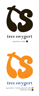
After spending time sketching and pushing the designs, it led me to these two designs. The first design (non-illustration) was inspired for my interest in animation and comic characters. The initials provide an exaggerated look, which is present in animation plenty of times. As for the type to spell out my name, I chose Perpetua Bold and using lower case letters. The lowercase represents the youth for imagination, and when one is young the imagination is unlimited. The Perpetua was chosen to provide professionalism within the imagination. For the color scheme was chosen for my interest in the complimentary schemes. To me, orange and blue is the strongest pair in providing warmth and cool. The orange also brings boldness to the exaggerated initials. More action.
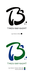
The second logo showcases a loose 3 in between the "T" and the "S". "Tres" does mean three in Spanish, and it's my nickname given to me from birth. Seeing I'm Roy the Third. I chose green for the 3 because it is my favorite color. Green is also the "third" color in the traffic lights. Red means stop and complacent, yellow means yielding and being hesitant. Green means go, being in motion, and moving forward. That is what I want to do in my design creativity: Moving forward, in motion, and not complacent. The three blue circles is to show an exaggerated cartoon face, as well as emphasizing "three". The font used is BlairMdITC TT Medium, and I saw the potential in this font. The sans serif has a nice contrast compared to the Perpetua Bold in the first one. Also, I lowercased my first initial in my last name for a reason: If you take my first name, and spell it backwards, you can still spell my last name. Just add "WYG" after the "S". With the font having capital letters for both uppercase and lowercase, it makes it more interesting.
While the project concluded last week, I have been taking time to refine the logos to make them better. I really do have faith in these designs, and I want to see them better.
